
During our most recent team day, the Snowdog Design Team engaged in a rapid redesign and reimagining process for the widely-used expense-splitting application, Splitwise.
What’s a design team day?
For any given company, team days can take on a variety of activities or purposes. The goal of the Snowdog Design Team Day is two-fold:
- To hone our design-thinking skills on rapid, conceptual projects, to exercise our creativity without the limitations of commercial work
- Foster collaboration, feedback, and team morale
Our team day typically takes on a unique 6–8 hour product challenge, that requires us to think critically and with empathy for users. It allows us to flex our creative abilities on projects untethered from our daily work.
The goal of this challenge was to investigate a finance app, identify usability or design issues and create solutions for them. We chose the app Splitwise because the concept is fairly simple, and it’s used by a lot of team members in and outside of work. Many of our colleagues have noticed there are significant issues when using the app, however there is a lack of alternate solutions on the market that provide the same level of capabilities.
What’s Splitwise?
Splitwise is a general expense splitting app that allows you to record payments or expenses and divide them in a way of your choosing between a friend or a group of people. It keeps track of group expenses (lunches, travel, drinks, etc.) so that you don’t need to worry about “who owes who how much”: it will automatically determine which members of the group owe money to those who have paid more than they have received back.
Why we chose it
The concept of Splitwise is extremely useful and convenient, and helps especially with many ongoing expenses (e.g. apartment roommates). But as we found, for new users and existing users, that the flow, navigation, and method of adding expenses can often be confusing. A lot of mistakes can occur on the way, which adds frustration and fear as it deals with money between friends.
What we did
- 10 a.m.: We started off with a team call to discuss the project overview, our goals for the day and perform some usability testing on someone who had not encountered this app before.
- 11 a.m.: We individually investigated the app to identify the usability issues that stood out the most to us as frequent or not-so-frequent users of this app, and looked at competitor solutions
- 11:30 a.m.: We came together to discuss our findings and research, and choose a specific functionality or view that we wanted to focus on
- 12 p.m. — 4 p.m.: We worked individually on our chosen issues, preparing solutions and UIs that address the usability problems we identified earlier
- 4 p.m. onward: We came again together for a group call to discuss and reflect on our solutions and get some feedback.

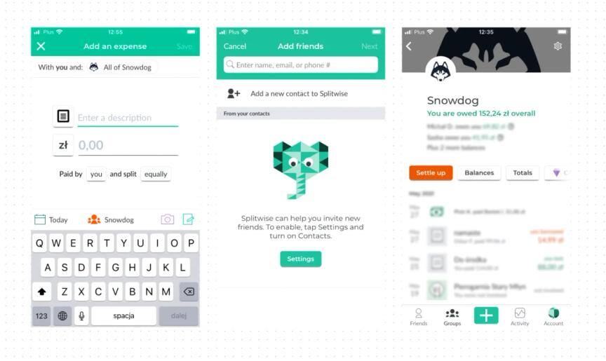
1. User Testing
We performed some quick user testing with Mat, who recently joined our team and who hadn’t used Splitwise before. He shared his screen with us, so we could watch, and talked us through his thinking process as he completed each task.
Task 1: Split an expense for lunch (pizza) that you have paid for. Everyone should pay for their own pizza, but the delivery fee should be split equally.
Observations
- Finding where to add new expenses within the group was easy enough
- When it came to splitting the cost, the default option is to split equally. There wasn’t a clear way to change this option.
- When Mat realized he needed to tap on the “equally”, he was presented with a lot of icons and unnecessary graphics that didn’t explain what they were. The lack of clear labeling for different functions was very clear.
- It took Mat a while to scroll down and find the names of the relevant people. As other team members had already noted, there was no search and the order of names was by date added to the group.
- Adding the delivery fee was complicated. He couldn’t figure out how to add it so in the end, manually calculated each person’s share and added it to their expense. But he had to scroll again to each name and find them to edit their total.
- Finally, he tapped on Done, but there was no clear submit or confirm button, which made him unsure whether he had performed his task correctly.
It’s hard to find people by scrolling on this long list — Mat
Task 2: Find out who in the group owes the largest amount.
Observations
- This was a difficult task and Mat was unsuccessful in completing it.
- He was confused by the fact that on the group page, the tab corresponding to “Balances” was not a list of overall balances, but more of an activity history that continually updates with people’s status or amount owing. Finding out who owes the most from this view would be nearly impossible.
- The other tabs also did not show the relevant information.
- In the end we showed him under settings, it was possible to view every group member and their amount owing or owed.
I would not find out the whole debt in settings area — why should balances be in settings?? — Mat
Task 3: Settle up with someone, assuming you have paid someone back in cash the amount you owe.
Observations:
- At first, it took Mat some time to find out where the settle up button was that corresponded to his debt. This is because you can settle up within a group context, or with an individual contact or friend.
- Mat got confused because in the group, he did not owe the same person who had paid for his expense.
- Once he found the correct place to settle up (by visiting the page for that individual contact) he was able to fairly quickly complete this task.
2. Exploring the app & it’s competition
We started exploring and testing the app and checking out the market competition for expense splitting apps. There aren’t too many solutions out there, and Splitwise definitely dominates with the most users.
Some fintech apps like Revolut have also introduced their own payment-splitting feature, but this is limited to groups where all users have Revolut accounts.

The key issues we identified as a group at this point were:
- The user path for creating a new expense and splitting it is not intuitive and quite complicated, and missing clear labeling/instruction
- In larger groups, it’s very difficult to find people scrolling back and forth. Editing each payment takes an extra long time.
- The group overview page is not very engaging or useful.
Overall, despite having 5 tabs, the navigation, and flow of the app is not so user-friendly and could be optimized to be more enjoyable and easy to use.
Ideating and Designing
We each chose an issue we wanted to focus on and separately went our own ways to start designing new views and flows for the app.
3. Solutions
Improving the path for adding expenses
Two team members came up with solutions for improving the expense adding process. The issues they aimed to fix were primarily improving the user-friendliness and simplicity, and make it faster to add the people involved (which didn’t require endless scrolling).

The first solution takes a form format which shows clearly each stage of the payment splitting process. All the options to split evenly vs unevenly are shown in a clear section, rather than requiring the user to move to a new screen. Finally, the confirm split button indicates completion of the task for the user.

The second proposal takes the user through a series of steps — first adding the expense, then selecting the people involved on a list (or by search). The list view here shows both who you have selected, the whole list of members, and a search bar. There is also an optional delivery input which will automatically split this cost equally and add it to everyone’s share.
Improving the views for group-specific pages and personal view
The aim in this solution was to create more rich, useful “overview” screens for both personal and group expenses. The current screen “Friends” provides little information, so was replaced with “Overview” and provides a dashboard style summary of overall balances, recent transactions and spending history.

The Groups listing page was also simplified to show each group divided into Work and Personal-related sections, with your overall balance shown. Inside the group, rather than just a big list of payments, there is a summary and balances for the team. Functions such as adding a new member or sharing an invitation link are found at the bottom of this screen, along with group settings. This avoids the confusion before where it was unclear where all this information could be found, and avoids the need for many tabs.
Optimizing the architecture and flow of the app
Another designer focused on simplifying the overall flow of the app. The app is used to split payments, but a lot of user attention is directed towards creating groups, tracking activity, and displaying the friends list. The presented solution takes a different approach; the primary user action is adding a transaction. Navigation has also been simplified to three elements: Dashboard, Transactions and Account. On the Dashboard, the user can check their balance in each group, and the last transactions they were involved in. From the Transactions view, they can add new expenses, view the history, create new groups and invite friends. This solution allows the user to easily distinguish between expenses with a particular person or group.

Final thoughts
With Fintech and money-related apps becoming ever more popular, this was an interesting area to explore today, especially as our team primarily has experience in the commerce industry.
We had a lot of fun performing the user testing — watching this live is something that is hard to replicate in remote conditions, but we discovered a lot of the app’s problems this way.
Our solutions show just how different as designers we think, and how valuable each perspective can be to the final product.
Team Day contributors:
- Clara Shen
- Danuta Sęczkowska
- Justyna Dobrowińska
- Vasyl Minin
- Mateusz Kozieł