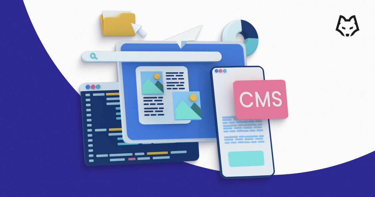
E-commerce navigation is a crucial element that plays a pivotal role in conversion rates, sales, and customer loyalty. It impacts nearly every aspect of your website, but perhaps nowhere more so than in the design and functionality of the main navigation menu. In this guide, we will explore four best practices to enhance the customer experience on your e-commerce platform while also delving into the importance of choosing the right menu module for your needs, specifically for Magento.
Tip 1: Tailor menus for different devices
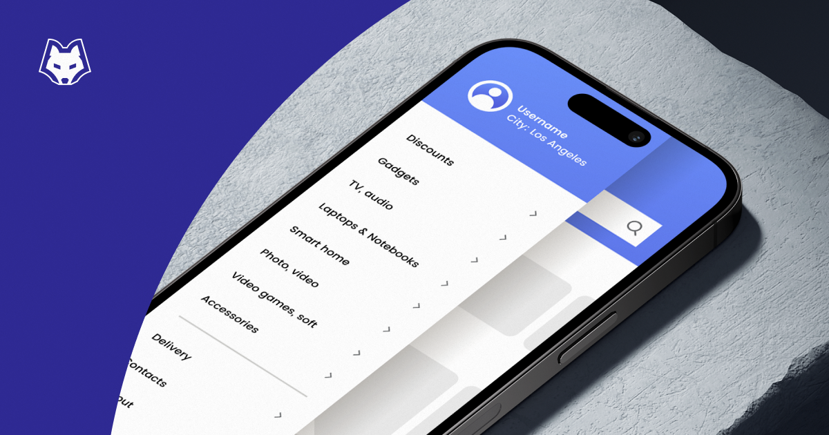
Browsing behavior on desktop and mobile devices differs significantly. There is a big disparity in the amount of space available and the mental models we use to understand and navigate a website. Mobile users, for instance, depend heavily on the main navigation menu for product discovery and exploration. As such, optimizing your mobile menu is critical for a seamless shopping experience. Consider streamlining your mobile navigation by prioritizing essential links, shortening labels for improved readability, or strategically rearranging items to place frequently visited pages closer to the top. Below, we provide examples of brands effectively leveraging mobile menus to offer quick access to vital links and provide an overview of their product offerings.

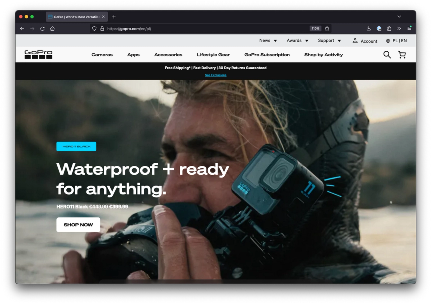
Tip 2: Distinguish courtesy navigation from product navigation
Courtesy navigation typically comprises of links to information that customers need less frequently, such as Feedback, Privacy Policy, or Account-related pages. When these courtesy links visually resemble or are placed in close proximity to product categories, it can lead to user confusion and distraction. To mitigate this, a widely adopted best practice is to employ a secondary menu or position courtesy navigation links within the footer, ensuring a clear separation from primary product-related navigation.
Tip 3: Introduce thematic menu categories
This tip is aimed at catering to customers who land on your site without a specific product or category in mind. Some visitors seek inspiration, look for gifts, or possess limited knowledge about your offerings. A conventional product menu might become a barrier to comfortable browsing and purchasing for such individuals. To address this, consider adding thematic menu categories based on a variety of themes such as seasons, occasions, activities, usage applications, or subjective attributes. These thematic categories can lead users to product listing pages with pre-applied filters, simplifying their exploration process. Take, for example, the Ikea website, which initiates its product categories with thematic groups, making it easier for users to discover relevant items.

Tip 4: Customise your footer menu
Often underestimated, the footer presents another opportunity to create a cohesive, branded experience and provide value to your customers. Leverage the footer to showcase essential elements such as newsletter signups, specific product categories, links to CMS or informational pages, and details for customer support. This space can be instrumental in highlighting your commitment to customer service and offering a comprehensive overview of your business.
For instance, the Our Place website's footer prominently displays the company's mission and frequently asked questions (FAQs), which are crucial for their target audience. Additionally, they provide direct links to specific, focused product categories to guide customers effectively.

Choosing the Right Menu Module for Magento
While implementing these best practices is essential, selecting the right menu module or integration for your e-commerce platform is equally critical. At Snowdog, we recognized that the native menu in Magento had limitations in terms of customization. In response to this need, we developed our own open-source menu module specifically designed for Magento 2. This module has been downloaded over 700,000 times and offers a cost-effective solution for enhancing the menu functionality on your Magento store. To explore the possibilities of our module and learn more about how it can benefit your e-commerce site, visit Snowdog Magento 2 Menu Module.
Conclusion
The main navigation menu is a cornerstone of your e-commerce site, influencing user experience, conversion rates, and overall success. By implementing these four best practices and choosing the right menu module, you can create a seamless and engaging shopping experience for your customers while maximizing your e-commerce potential.