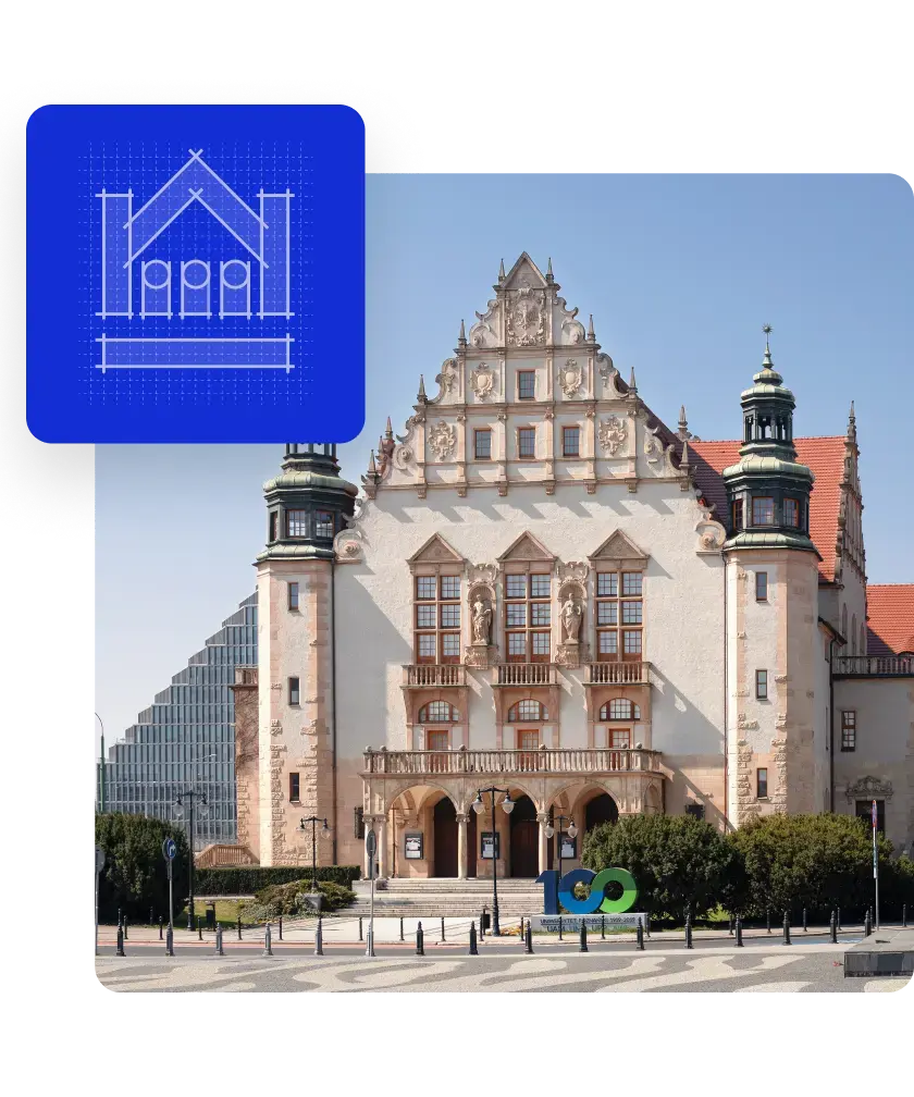
Challenges
-
Navigation: We had to create a clear, intuitive way of navigation not based on satellite navigation (e.g. GPS). At present, the satellite navigation technology is incapable of accurately locating inside buildings, which required finding an alternative solution.
-
Tailoring the app to different needs: We had to balance the information for different user groups so that various groups of people, e.g. neuroatypical or visually impaired, could use it in an easy, user-friendly way and get the information they were looking for.
-
Scalability: We needed to design and program the application so that more campuses and buildings could be easily added in the future.
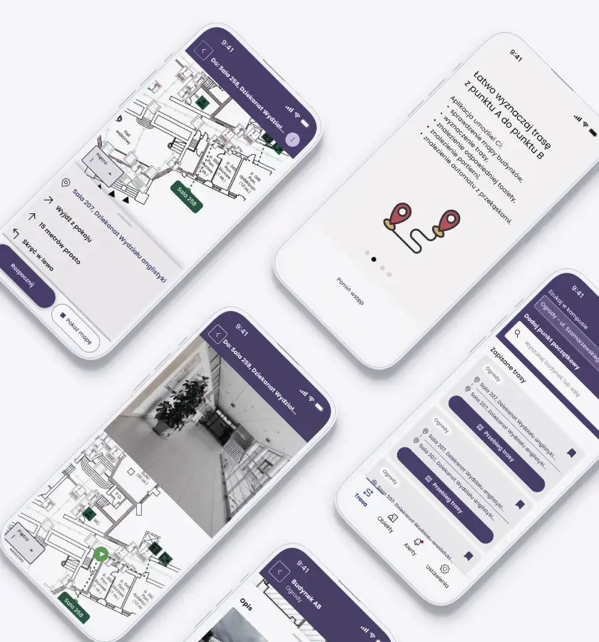
Maps
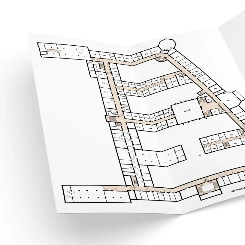
In order to complete the project and make it navigation-ready, we went through all the buildings indicated in the project, which came up to exactly 62,978.2 sqm of space. We wanted to capture the exact shape and number of rooms. We verified the old building maps and made corrections so that all doors and rooms were in place and marked relevant obstacles and facilities. We drew 933 rooms and 1187 elements, including doors, elevators, and toilets, with unique identifiers to add additional descriptions and photos. In the end, we set out 910 different routes. Furthermore, we digitally redrew all plans in open .osm format to display them using popular map rendering engines in the mobile app.
Route engine
After creating the maps, we developed a custom navigation engine. The engine determines the shortest path in a building taking into consideration user preferences, e.g. avoiding stairs. The project uses data in GeoJSON format and draws inspiration from the open source OpenLevelUp. The engine returns information to plot a path on a map and generates text instructions taking into account doors, elevators, or stairs along the route. It supports the English and Polish languages.
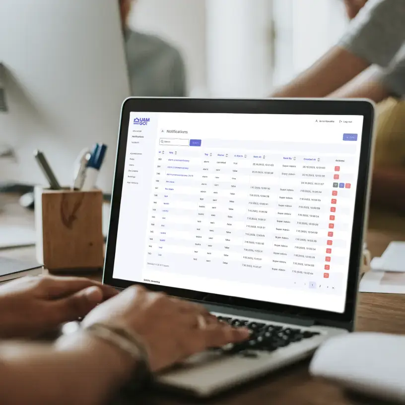
Content management system
We created a customized content management system for building administrators. Thanks to it, administrators can: update maps, edit room descriptions, add photos of e.g. stairs, send notifications regarding alarms, exclude locations from routes in case of repairs or equipment failures, and receive notifications from app users when there is a problem in the building.
Logo design
The application's logo consists of a signet, which, in a minimalist, linear form, refers to the characteristic facade of the University's main building. The logotype, which is based on the author's typography, focuses on clear, legible and simple yet dynamic letter forms. The whole design has gently softened corners, telegraphing a more friendly, organic character.
We paid special attention to the readability and contrast of the typography used in the identity, as well as in the app itself. We used one of the most legible fonts, "Poppins," in the headers, while the continuous text is "Atkinson Hyperlegible," a font developed by Braille Institute of America specifically for the visually impaired.
Interface design
We started the project with a thorough analysis of the materials provided by the client. Among them were the results of exploratory research, individual in-depth interviews, user stories, personas, architecture information, and a prototype of the app. During multiple brainstorming sessions, we came to the conclusion that a thorough redesign of the application wireframes was necessary. We developed a new prototype, the correctness of which we verified during tests with students. Following that, we prepared a complete graphic design of the application complemented by a well-thought-out logo.
When designing the interface of UAM Go app, our main goal was to make it as readable and intuitive as possible to ensure good user experience for everyone, regardless of their level of tech proficiency. During the development, many elements of the design were changed after analyzing the results of the user testing, which allowed us to further customize the interface to meet the needs of users.
We developed a comprehensive design system, including color palette selection, consistent typographic rules, icons, spacing between elements and interactions. This ensures that all elements of the app look and behave consistently, making it easier to manage and develop the interface in the future.
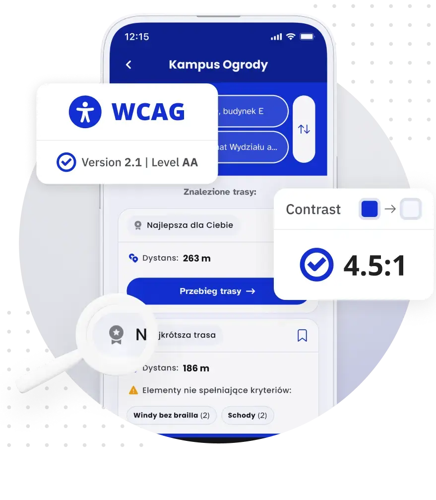
Accessibility
Design - We ensured proper contrasts for light and dark modes, button size, and easy navigation between screens.
Assistive technologies - We ensured appropriate buttons and interactive elements without visible titles were descriptively labeled and in the correct focus order. We also added additional instructions for visually impaired users. Since maps are inaccessible to the visually impaired, we prepared descriptive navigation based on successive route sections.
The app can be operated using an external keyboard, as well as using standard gestures available on iOS and Android, such as scrolling the screen or returning to the previous view. Throughout the development process, we tested the app using screen readers, automatic tools, external keyboards, and various system facilitation settings, such as increased font size, increased contrast, or landscape phone orientation.
Customization - The application is available in two language versions: Polish and English. It can be displayed in light or dark mode, and in portrait or landscape orientation. We have also provided the ability to zoom in on the text and specially designed the app so that it remains functional even when fully zoomed in.
Content accessibility - We ensured that the language in the application was simple and inclusive, both for microcopy and larger blocks of text. We have ensured that content is structured appropriately and understandably, and that errors are handled.
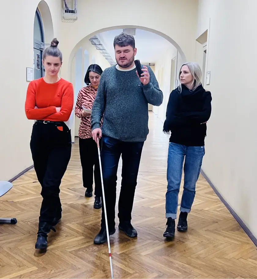
User testing
We conducted four usability testing sessions on prototypes and test versions of the app. Each round of testing involved a diverse group of participants, including people with visual, hearing, mobility and cognitive disabilities. This diverse pool of participants allowed us to comprehensively evaluate the app's usability for various accessibility needs and optimize solutions.
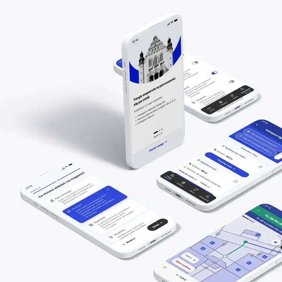
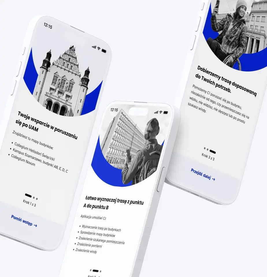
Onboarding
The onboarding process consists of a series of screens that allow the app to be configured to the user's individual needs. Route option settings allow the user to specify their route preferences, e.g. "I prefer mirrored elevators" or "I want to avoid stairs." Based on these choices, the app determines customized routes.
Display settings allow the user to select which elements will appear on the map in the form of pictograms (such as ramps or thresholds). Onboarding also serves an educational function, as it shows all app users what facilities can be found in the university's buildings and explains difficult concepts such as tactile maps and induction loops.
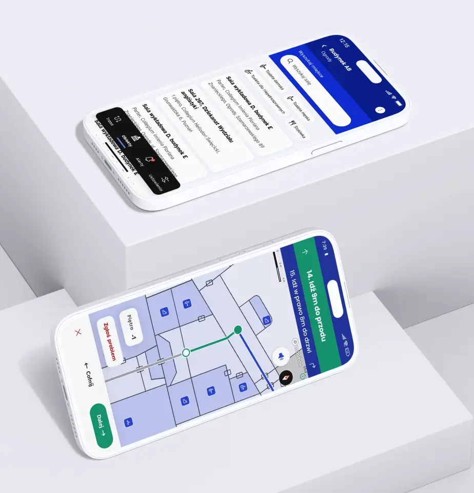
Navigation
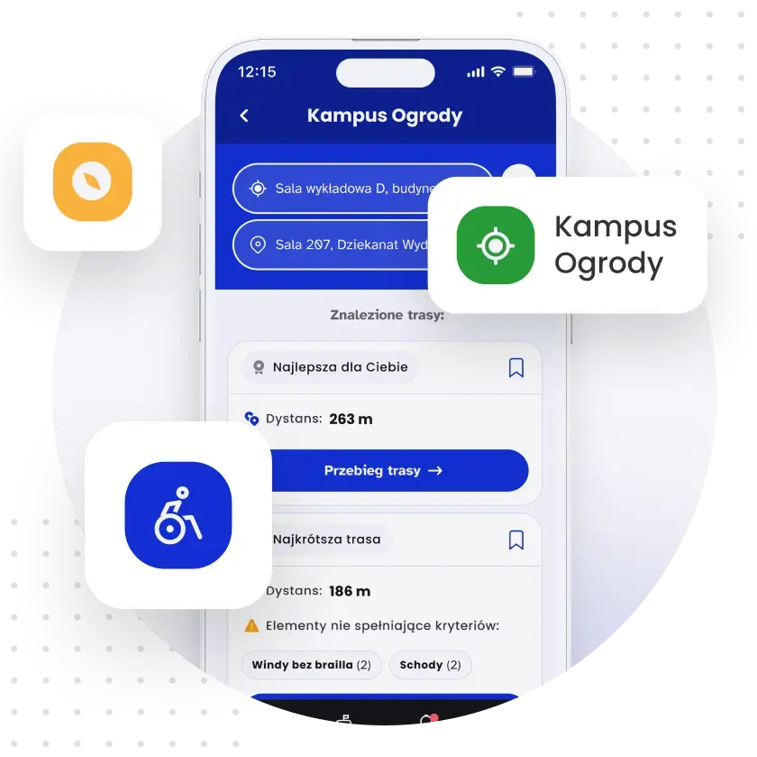
The main function of the app is finding routes to specific locations in the campus. The user enters a starting point and an ending point and the search engine returns suggested routes tailored to the expectations set during the onboarding.
Our navigation works step-by-step, presenting the user with messages such as "go left 15m" or "take the elevator to the second floor." When designing this feature, the challenge was to break the standard thinking model of users, who usually associate navigation only with satellite navigation systems. To make it easier for users to understand how the navigation worked, we linked the text directions to the current section on the map using the same color and added short pop-up instructions.
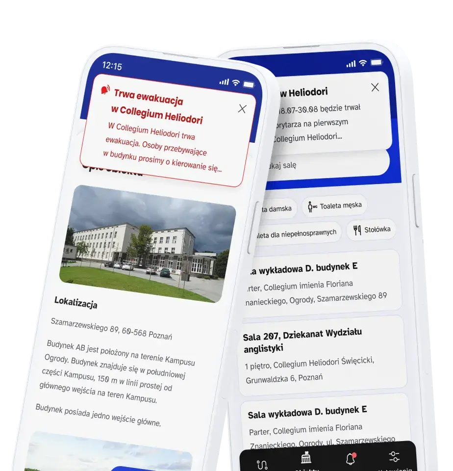
Alerts
An important aspect for the university was the ability to send information to users of the app. The Alerts tab can show warnings about evacuations, repairs, or emergencies. The highest priority notifications, such as those for evacuations, are displayed as notifications even when the app is closed.


© 2026 Snowdog