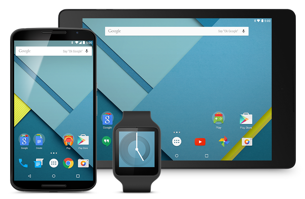
New looks of Android
With the recent release of Android Lollipop SDK, new Material Design became widely available for users and developers. Google re-designed Android layouts with a new “visual language”, that provides a consistent, elegant, and very plausible user experience. It’s achieved through ripple touch feedback, cards, view transition animations, and view's elevation API, which uses shadows to determine view's parent in depth space. Developers were also given great design guidelines for typography (Roboto at it’s best), colour Palettes, spacing, and views usability (like button usage, dialogs, or animating visual feedback) connected with good explanation of users expectation to the overall app usage experience.
Material Design in action:
Compatibility Package
Users and developers of Pre-Lollipop Android devices, were not left out, and can still enjoy few of new Lollipop goodies. With new AppCompat v21 Library, Google placed on developers hands part of backward compatible Lollipop-APIs. In the package we’ll find:
1. Newly introduced Toolbar widget. It’s a generalization of the Action Bar pattern that gives us much more control and flexibility. Toolbar is just another view in view’s hierarchy, so we can add multiple instances to different views and layouts. Below we can see three Toolbars used in main, list, and detail view.

Libraries:
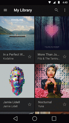
2. RecyclerView– Google describes it as: efficiently displaying large data sets by providing a limited window of data items. It’s like the ListView, but it uses different recycling approach, that allows views to be reused. It greatly improves the performance of the Widget. 3. CardView– A FrameLayout with a rounded corner background and shadow. It also uses elevation property for shadows. 4. Palette– lets us extract a small set of prominent colors from an image to style the UI controls; creating an immersive experience. The extracted palette will include vibrant and muted tones as well as foreground text colors for optimal legibility.
Widget tinting with Palette library
AppCompat itself also got some new features.
First of them is the support for new color palette theme attributes. Now we can easily customize our theme to fit our color palette with primary and accent colors. It’s as easy as defining the colors in the values/themes.xml file, and AppCompat will propagate them to the framework, giving our app new color scheme.
Second one is the widget tinting, which makes every widget more “fit” into the app colour scheme. It’s done using colours defined in the previous point. At the moment the option is available with these widgets:
- Everything provided by AppCompat’s toolbar (action modes, etc)
- EditText
- Spinner
- CheckBox
- RadioButton
- Switch (use the new android.support.v7.widget.SwitchCompat)
- CheckedTextView
Developers were also given the new SearchView Widget, that has updated to the Lollipop style structure, instead of old theme attributes.
More is coming
Unfortunately, not all Material Design components were already implemented in the support libraries. At the moment there’s no support for the: 1. Ripples – dynamic surface touch reaction. Lollipop has a new drawing engine, that allows these kinds of effects. They’re not supported in older Androids. 2. Also most of the components that comes with new Lollipop, are not yet available. We can find the list of the components here. 3. Elevation API methods are present, but using them gives no effects.

We’re hoping that the support libraries will be consequently updated, with the rest of the components, as new Android visual language looks really great, and is truly enjoyable to use.