Ensuring accessibility for all users, regardless of how they access the web, is a fundamental principle that should be embraced by every website. At Snowdog, we are committed to upholding this principle by striving to make every project, particularly our open-source endeavors, accessible by default. To guarantee the quality of our accessibility efforts, we took a proactive step by inviting a user who is blind to test several websites. Among the projects that underwent rigorous testing, our open-source venture called Alpaca held particular significance. Alpaca serves as the core code base for several of our clients' Magento stores, making it a top priority for us to ensure its accessibility.
If you're interested, we encourage you to explore the Alpaca theme on our stage by visiting the following link. This will provide you with a firsthand experience of our commitment to creating inclusive digital experiences.
Project Goals - What we've learned
We do our best to develop great websites and apps that are accessible from the beginning, and by designing and developing inclusively. However, it’s quite tricky to test websites from a user point of view, let alone from a user with permanent or temporary disabilities.
Even if I tested our solution with a screen reader, it’s not the same, because people with disabilities used assistive technologies (AT) in daily life to operate the whole system, not only a web content, they know a lot of tricks, shortcuts and features that are hard to adopt by a tester in short time and use them efficiently. Nothing can replace a live testing session with a user. - Ania Karoń (workshop coordinator)
That’s why we invited Przemek, who very kindly agreed to come into our office for a session of testing some of our internal and live projects. With him, we were able to test our websites to see how our implementations were doing in terms of a11y, and educate our team about it. It showed us some of our successes but importantly highlighted for us the problem areas we need to improve on. Przemek gave us a new perspective and we’re sure in the future this will help us empathize even more with our clients and users.
Overall, it was a very useful session, and we can recommend organizing such workshops no matter how big or small your agency is.
The tester
Przemek is 29 years old, congenitally blind, and does not use a computer during his day job. He uses the web regularly on Windows with NVDA and a smartphone running Android and TalkBack, mainly for reading articles (news, blogs), and social media (Facebook on mobile view only). He also buys things like music, books, tickets for sporting events, but not clothes, and uses his phone for navigation, maps and transport schedules. In his free time he likes to play both in browser and native app games — his favourite game is Football Manager ⚽️.
This information gave us a bit of background and general idea of Przemek’s technology usage and skill level, and what his priorities and needs would be when using the web and finding relevant content.
What and how did we test?
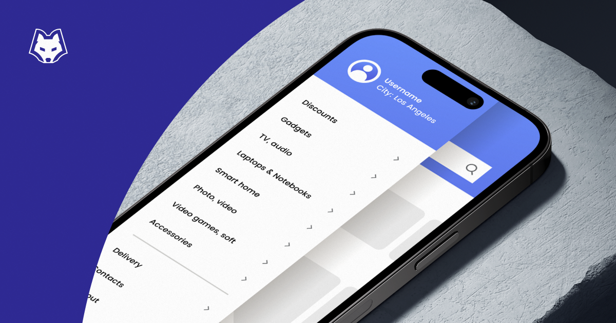
Alpaca is an open source Magento 2 theme built by Snowdog’s front-end team, and follows design systems principles. It is built on top of its own open source components library and menu module which was designed and developed in house. The Magento version being tested was 2.3. We use Alpaca components for many projects, and for us it’s important to keep testing and reviewing the theme so that it constantly improves.
Before Przemek arrived, we prepared some test scenarios, data and tasks, such as:
- Placing an order as a guest
- Creating a customer account and logging out
- Logging in to an existing account
- Placing an order as a logged in user
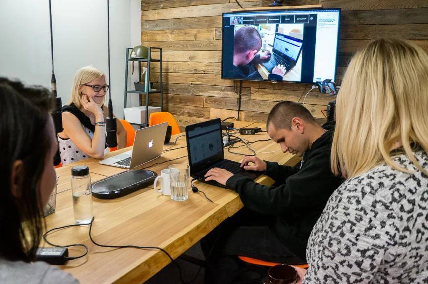
When it came to our actual testing session, we adopted a more informal and flexible approach. Przemek was talkative and interactive, so led the exploration as we watched, gave him tasks and asked him questions. It was a great way to gain insights and he communicated his thoughts and actions with us very efficiently.
We recorded each testing session on multiple cameras, and Anna, the workshop coordinator, was there at all times to guide the session. PMs, designers, UX, and developers came into various sessions to ask questions and observe. It was a great session and we were really grateful that Przemek was extremely accommodating and talkative throughout the entire day.
You can have a listen to a small part of our workshop, and observe how fast a screenreader talks!
An excerpt of our testing workshop with a screen reader (in Polish) is available here

Usability issues identified
We went through a lot of elements and features of the Alpaca store and learned many things along the way. Here are some of the usability issues we identified during our testing session
- After the full page loaded, the cursor jumps to the top of the page which is connected with Magento 2 content dynamically loaded with Ajax
- Notification banner is not read out when it appeared on the page
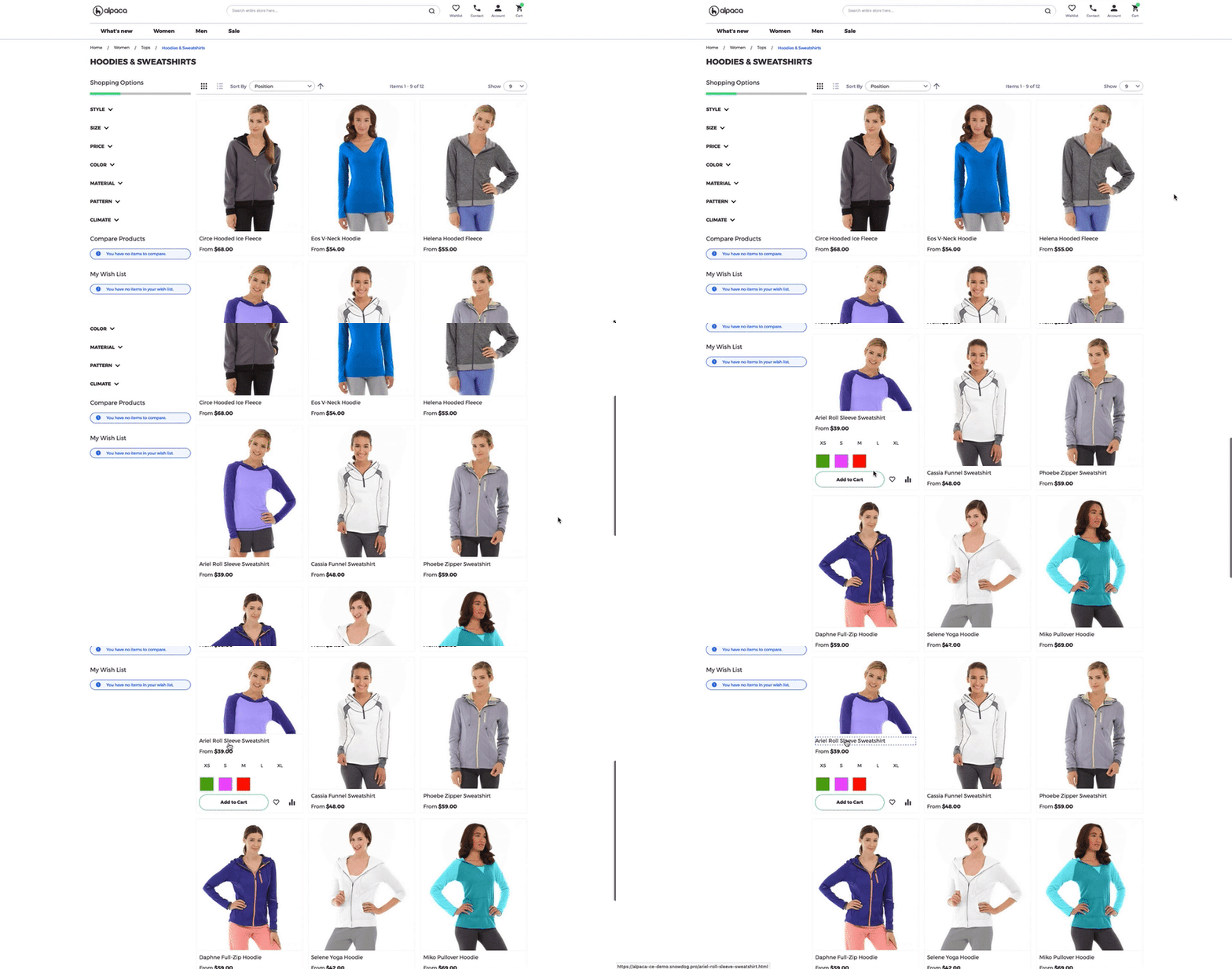
- On the category and product page we found some issues with graphic presentation of product option, size and colors (called swatches in Magento 2). Despite a11y support, those options are hard to find, because the container is not fully accessible. Moreover, those options are built based on input which was seen and operated differently with a screen reader, which caused a problem with Add to cart form validation. Fortunately, an experienced screen reader user is able to handle buying action with desirable and required options chosen.

- Unsuccessful add-to-cart events are not seen; empty required fields are not announced until the user deliberately go back through the form elements
- Product page organization provides product description after a call-to-action (buy). Maybe a short description added before Add to cart form could increase conversion.
- We found some unlabelled icon buttons on Product page and some tooltips on checkout that aren’t fully accessible.
- On the registration page, the date-picker component isn’t available for AT and doesn’t gain the focus, so there is no option to choose the birth date. There is also no information about the date format.
- The validation method for Recaptcha is unclear, and does not always appear.
Usability successes
There was some positive feedback about our theme, which confirmed for us that although we weren’t at 100% accessibility, our efforts so far had made some impact and improvement upon the classic commerce site.
- The mini-cart was well described and labeled — it gave instant information about the number of products in the cart through the screen reader
- All header content was accessible
- In general, most content on the category page was accessible (filters, toolbar, product grid, add to cart)
- Product page and checkouts were both generally accessible
- Compared to another well known and large commerce site in Poland, Przemek found Alpaca easier to navigate and use
What did we discover?
- The absolute speed of screen readers! We could barely understand and keep up with how quick the screen reader was speaking, even after Przemek slowed down the speed for us.
- Screen reader users navigate through pages using semantic elements like headings, links, buttons, lists, tables, etc. They usually don’t skip links or the standard menu navigation.
- With an accessible mini-cart, a user employing a screen-reader doesn’t see the difference between a mini cart vs a shopping cart page. This could be an issue because there are additional options on the full cart page (gift cards, discount code fields, extensions). Maybe some additional description is needed in the mini cart to link to the full page.
- Blind users generally do not buy clothes or shoes on the web
- Like any user with vision, Przemek scanned pages quite quickly by skipping over large amounts of web content that are enclosed in a <span> tag. He could miss out on essential information if it’s not organized meaningfully, like us. This highlights how a11y is for all users.
Try it yourself
You can try using a screen reader yourself with this site and see what it might be like using the page as a user with vision impairments.
- If you’re using a Macbook: VoiceOver
- If you’re using a Windows laptop: NVDA
- If you’re on a Linux system: BRLTTY or ORCA
- If you want to use a mobile device, check TalkBack for Android or VoiceOver for iPhone
We hope you’ve been inspired by this post to try a11y on your own website or at your own company, and don’t be afraid to fail and get things wrong during the process!


