
Our experience collaborating with Australian and US wineries led us to create a seamless customer journey for alcohol retailers, particularly those with brick-and-mortar stores. We sought to utilize the unique features of a fully integrated commerce experience.
Effortless Purchase and Pickup Process for Alcohol with Comprehensive Brand Discovery
Our aim was to design an effortless purchase and pickup process that allowed customers to explore and purchase alcohol online, then pick it up and pay for it in-store during their regular shopping. We also wanted to offer a comprehensive experience where customers could learn about and discover new brands.
What we offer ?
- Brand strategy
- UX Research & strategy
- Unified commerce experience
- UX/UI Design
- Magento Commerce consulting
Discovery
We first set out to read, research and explore the problem scope. We already had some detailed market analysis and trend reports that gave us information about real customers.
User goals
- Buy desirable wines at an affordable price
- Learn more about wine regions, grape varieties, tasting notes, pairing
- Easier way to choose and decide which wine to buy
- A convenient way to order alcohol online and pick it up in their local store
Business outcomes
- Attract less knowledgeable drinkers, as well as connoisseurs
- Increase overall in-store cart value
- Craft a friendly guide and partner for alcohol buyers, and democratize knowledge about alcohol
Overall, we wanted to design a website with atmosphere and style to reflect the world of alcohol. We wanted to optimize the navigation, categories and product search so that users are exposed to different discovery paths to find new products. When buying drinks, you can’t taste test them, so it’s important to elevate the other senses when trying to sell the product.

Lovers and The Daring
There were 5 distinct groups of shoppers, but we decided to target two of them to avoid a too-broad problem scope. Together they make up the majority of customers, and bring in the most business value:
- Lovers — Enthusiastic wine lovers who like choosing, buying and pairing drinks and discovering new flavors
- The Daring — Users who primarily buy by price, but willing to learn and explore more varieties of products and gain knowledge
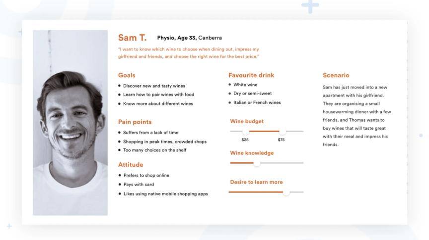
As a lot of supermarkets or grocery chains are already recognized as cheap and affordable places to shop, we decided to focus on these groups — which made a large and growing portion of the market and need more than just low prices to help them choose drinks to buy online. Other features like reviews, education and promotional offers tie all the other user groups together so we could address as large a scope as possible. From this research we developed a persona; Thomas, a wine enthusiast who is looking to improve his wine knowledge and impress his social circle at friendly gatherings.
Design
We performed our own field research and experienced the online and in-store purchasing process of a few stores ourselves. Combined with the user persona, we used this information to build a customer story and experience map, from which we identified a few problem areas where they might struggle or feel frustrated. These also gave us some opportunities to deliver a better experience through the website design and features of the whole buying process.

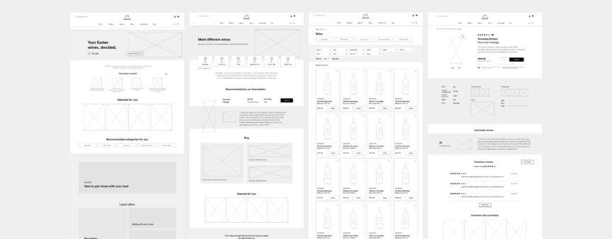
Wireframing
After discussion of all the features and prioritizing solutions to the issues we found during research, we started wireframing our ideas and the site began to take form. This helped us especially to see how our ideas would look on a final page, and whether we were adding too much or too little.
Our solution
1. Excellent choice
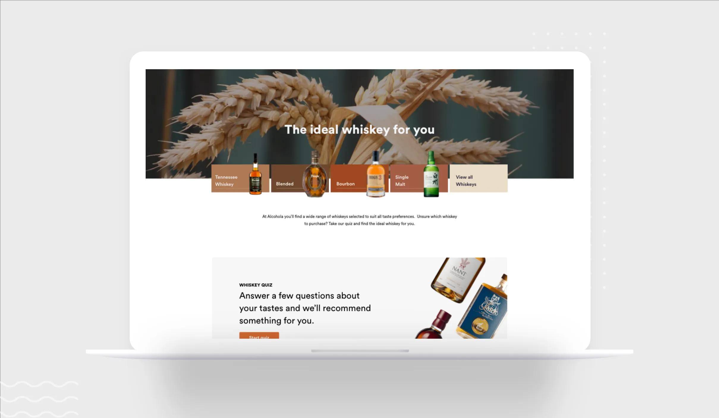
It’s not easy to choose products from such a large collections. We focused on reducing cognitive load and encouraging particular discovery paths that users could take. They start from different points of the site; navigation, home pages and extra features like quizzes. For a site with access to such a large market, personalization features are extremely useful.
Navigation: The previous navigation was unbalanced with overloaded options and categories. We pared it down based on popularity and also provided some alternative product discovery paths. Importantly, for users like Sam, they can easily filter down by price or pairing.

Filters & Grid: The product grid is the equivalent of browsing the shelves and the best way to help users find what they want based on different preferences is with filters. We went for a top filter that would remain sticky so the most popular options are available at all times to help product navigation and discovery.

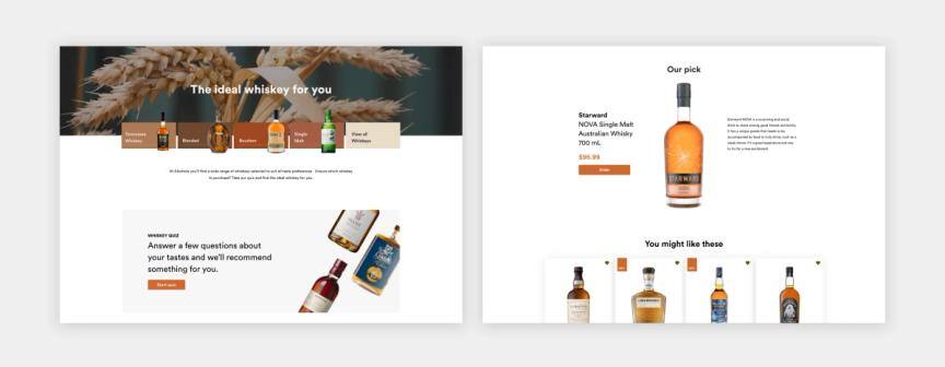
Search: A rich search result has a huge impact. From providing inspiration and discovery pathways to exact product thumbnails, there’s plenty of information displayed to help customers and lead them to their desired purchase.

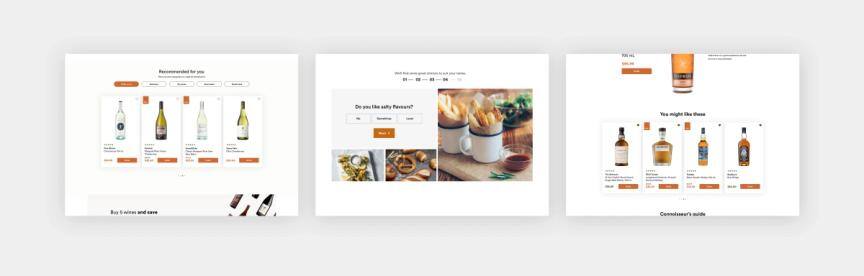
2. Getting Personal
With such a large range of products, business intelligence and audience segmentation is key to making sure users see products relevant to them. We created recommendations, taste quizzes and seasonal content to suggest products based on user tastes, popular occasions or themes.
3. Demystifying wine
Our market research showed that a large portion of users were open to exploring and wanted to learn more about wine. But for many people, buying wine can seem complicated. Our goal is to change that with Alcohola, with a range of different features.
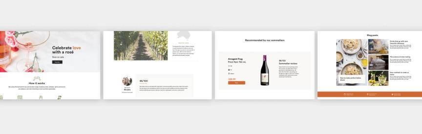
Establish trust with expert knowledge: We added elements of product knowledge and expertise on different pages depending on the purpose. On the product page we have details about the wine itself, the grape, the region. While on other pages, we have added blog content, or sommelier recommendations. We aimed to keep all the information digestible, in an easy-to-understand manner.
Educate with blogs: A large group of respondents said they would like to learn more about wine: how to drink it, what to eat with it, how to choose it, and how to pair it with occasions. Blogs are a great way to achieve this and keep the pages fresh with new content.
4. Know your bottle
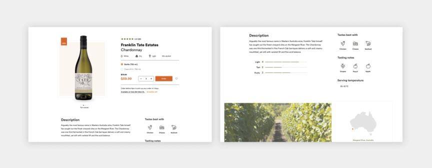
In our research we found that most hesitation in buying alcohol online was the inability to closely inspect bottles and also a lack of detail or information online.
Product detail page: the product page is the main hero of this website. It’s designed to capture user imagination and emotion that is so commonly associated with wine and alcohol, but through visuals only. So the design was absolutely critical here, and had to convey both information and knowledge as well as evoke the senses. The idea was to create a sense of seamlessness between online and offline shopping, using a large image of the bottle that can be rotated so it’s almost as if you are browsing in real life.
Intermediary category page: We introduced a sub-category page to further education or entice users to explore different types of a product they already like, such as wine for example. This does not overwhelm users by piling on irrelevant information, as the page is restricted to a certain type of alcohol. We wanted a playful design to reflect the true range and diversity of the product.
We wanted to design specifically for our user groups because all these solutions indirectly support business objectives like in cart value and customer loyalty. These features not only help users make decisions, but will ultimately increase the value of their purchases without overly manipulating or aiming to trick them. By helping them learn more and explore alcohol, they can come to trust this brand as a place to go for knowledge and helpful purchasing advice. In combination with a trusted, physical store, the experience can go a long way to building strong business-client relationships.
The concept
Our final experience concept is much more than just the website. It’s about how the website interacts with the customer through many different channels — from the online content and imagery to physical store reminders/triggers, and other methods of notifications (SMS/Email). We also sketched ideas on how to present this flow of ideas and overall concept to our client.

Conclusions
Snowdog serves a lot of different retail industries, including alcohol. It’s a rapidly growing market, especially with the increase in online alcohol ordering. While you can buy alcohol in their stationary stores, we wanted to explore the online market and design an experience allowing customers to pick up their orders at their local grocery store. We want to provide a space to expand user knowledge, excitement and discovery of new wines and other alcohols, as well as help them make the right decision for their needs. By crafting a specific persona based on a selection of their market segments, we designed a whole experience spanning the physical and online touch points that would support our persona the whole way through their purchase.
Thanks for reading!
Designer: Vasyl Minin | UX & Strategy: Danuta Sęczkowska & Clara Shen
Snowdog In 2018 we were awarded Most Innovative Customer Experience at the Magento Imagine Excellence Awards with our client…Snowdog