Our task was to enhance the user experience of the Blomberg website, tailoring it to a niche audience seeking top-notch home appliances.
Transforming Blomberg's Website:
Blomberg produces home appliances for consumers and distributors in the US market that serve high-quality European designs at competitive prices. They are experienced in European design trends, compact designs, and creating stylish urban appliances. We were approached with a UX Redesign brief that involved improving the website functionality and experience to support an increased focus towards catering to businesses directly (builders, architects, and designers). This included redesigning the information architecture, the features and functionalities matrix, and producing wireframes of our solutions for key pages.
The final goal of this project was to drive more traffic towards business-related pages and content, increase contact form submission and therefore allow Blomberg to become a key appliance touchpoint for builders, architects, and designers.

Research
Reasons for Redesign
- Build relationships with builder, designer, and architect community
- Instill confidence and trust in business users as a quality brand
- Improve usability so users more easily find relevant content, products, and information
The existing website is quite simple and minimal. Although it contains a lot of documentation and data about Blomberg products, the design and functionality of the site doesn’t really fit this purpose. As a result, users cannot find what they need, ultimately weakening the business strategy.
Research methods
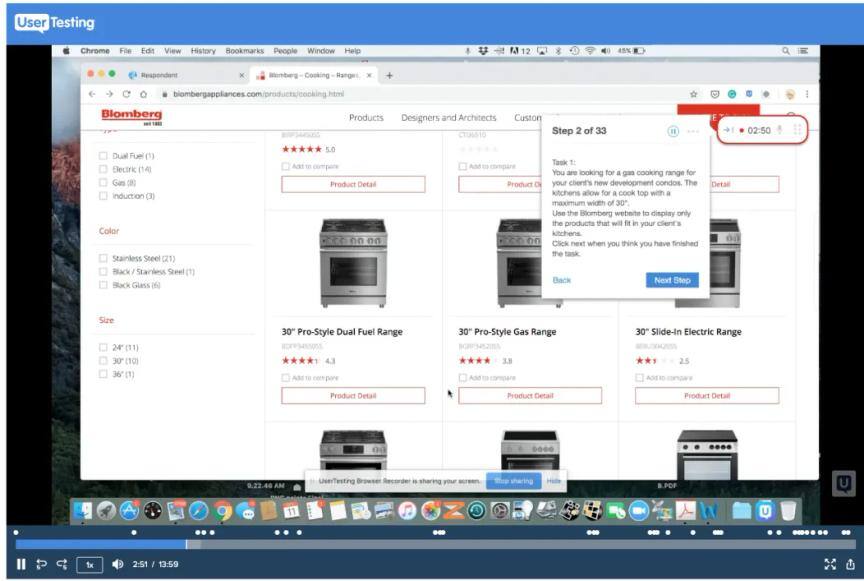
We used HotJar, Google Analytics, and UserTesting.com to observe how users navigate and use the Blomberg website.
- HotJar was installed on the existing website, which provided us with heatmaps and session recordings so we could observe user behavior.
- UserTesting.com was used to observe 5 people from the target group (architect, interior designers, and builders) aged 46–58, from the USA and Canada. We prepared a series of tasks involving finding products, comparing them, finding key information, and downloading resources. The sessions were roughly 20–30 mins long.
Some of our findings from HotJar included:
- Most users are ignoring key banner or header content, especially those in carousels
- Users are likely to use filters
- Copying the product item number is a frequently performed action
- Users spend most time on product detail pages searching for a specific parameter or detail
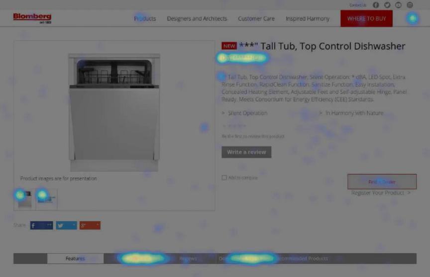
Overall, most of our findings from HotJar pointed to the fact that although the website is designed aesthetically well and cleanly, users are having difficulty finding relevancy and finding information they need. This was further supported by user sessions recorded on UserTesting.com, where we provided a few scenarios and tasks for architects, designers and builders to perform on the Blomberg website. We also discovered the following issues:
- Generic images make it difficult for users to assess the purpose of the website
- A lack of useful filters
- The compare table was poorly implemented
- Navigation headings were ambiguous
- Important information is missing from the specifications table
- The brochure maker is a very useful feature, but not where users expect it to be
Quotes from UserTesting.com
“The website is well done, clean/modern, and as an architect and designer it appeals to me” “… but once i started searching for appliances, it became a difficult, frustrating, stressful task — and it shouldn’t be — appliances come in standard sizes, features, etc.” “The aesthetics are great, but more attention to functionality is needed”
Designing the solution
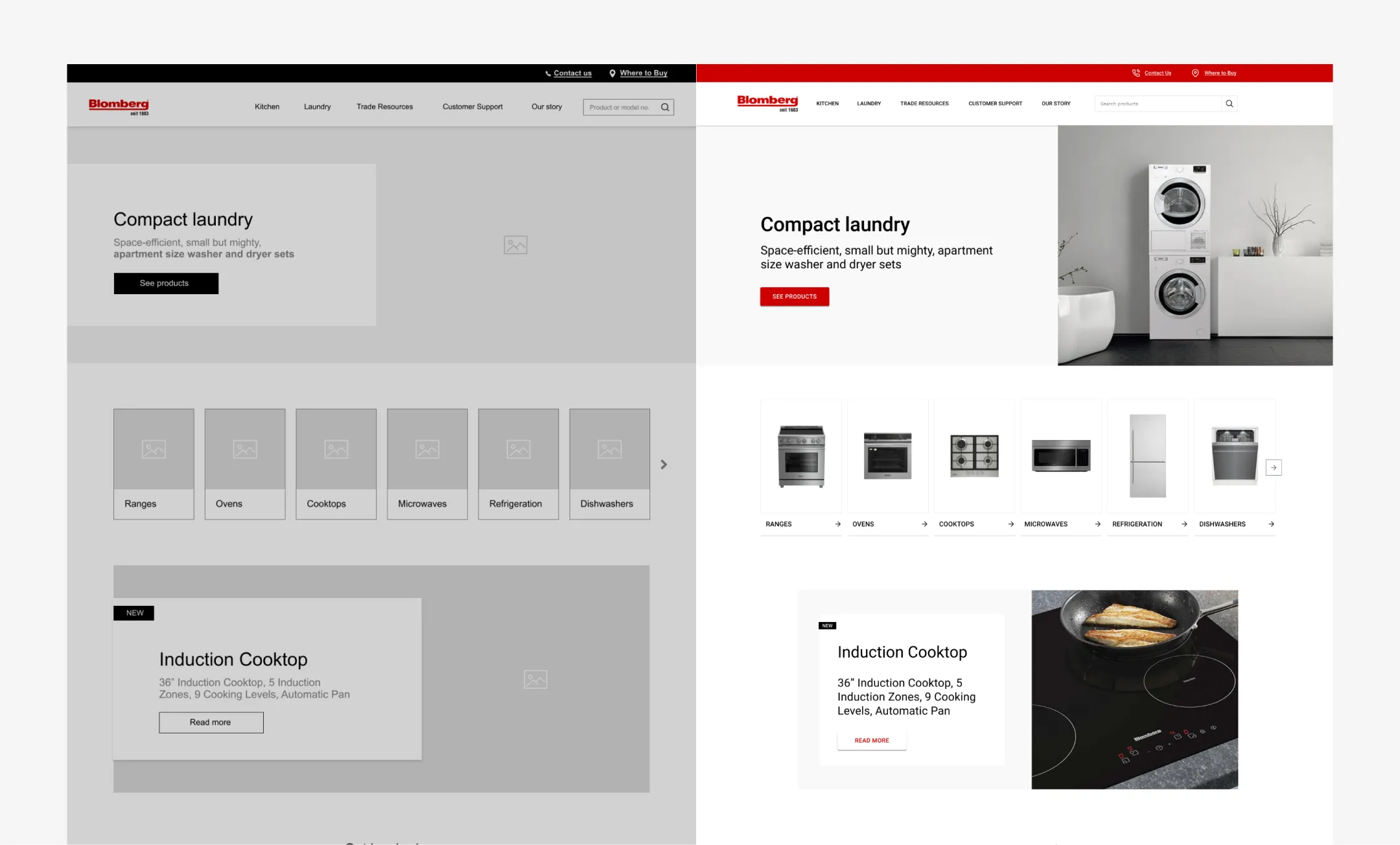
Information architecture
The existing navigation structure was a little neglected. There were some redundancies present and some bloated areas of navigation which were diluting the categories and sometimes misleading customers. We wanted to tighten the information architecture so customers are clearly guided to useful tools and of course, products.
Some of the key improvements we made where:
- Make top navigation elements unambiguous and clear
- Remove “Products” heading — a redundant navigation title
- Make it clearer and easier for the target audience to find tools such as “brochure maker”
- Remove ambiguous titles regarding marketing content that may be misinterpreted or mistaken for something else
After comparing the IA with some other well-known appliance brands, we decided to create the following solution. We believe it balances well the need to promote and show products, as well as direct users to useful tools for our niche.

New features/functionalities
Working with their website team, we created a new features and functionality matrix for them that included some new features and adapted/rearranged existing ones to better suit the business goals of the website, which was to attract and engage businesses, builders, architects and designers looking for appliances for their clients.
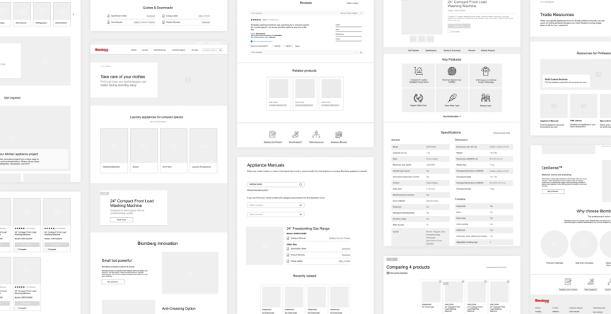
Once we had established a new features matrix, we went on to create content wireframes. This provides a skeleton of what content will look like on each view or page, upon which we can construct the design.
Some of the changes and improvements we recommended were:
Brand and Visual
- Web responsiveness and refactoring padding and spacing to better adapt to different screen widths; with designers and architects often on-site or on their phone, they need a website that readily adapts to small screens.
- More contextual and people-focused imagery or photography. The existing photos were very professional and modern but perhaps too stock-like and less relatable for users.
Global functions
- Secondary navigation- Where to Buy and Contact are global functions that should be available and seen always, so we moved them to a smaller, secondary navigation bar at the top of the page, while the main navigation bar could be focused on products, information and website features/tools.
- Breadcrumbs are an essential feature that allows users to quickly switch between levels of categories without having to re-navigate from home.
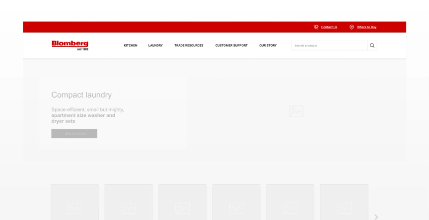
Homepage

- Inspirational content — the homepage is minimal and quite aesthetic, but there is room for providing more relevant content or links o increase engagement from the homepage
- Blomberg’s Instagram feed and social media channels are aesthetically pleasing and provide a great way to show their products in action, which is highly convincing to users.
- Trade resources need to be promoted from the homepage, to show users of our niche target that they will find some interesting features and tools that are not found elsewhere.
- Blomberg provides some very useful customer service tools and guides, these could also be highlighted from the homepage.
Intermediary Category Page
- We recommended implementing the first level of product categories as intermediary category pages. This helps users see the scope of products at a glance, avoid displaying a big product grid with irrelevant products to dig through, and great for promoting navigational paths and guiding users to make the right decisions. The ability to add previews and extra content gives users more information and guides them through the discovery process.

Product Listing Page
- Filters — the existing filters were lacking in some features that clients may value. Therefore we wanted to extend the filter section with more relevant options, as well as removing filters that did not aid the discovery process.
- Grid view with infinite scroll — clicking a button to navigate to another page of products seemed less useful for this website. So we recommended implementing a “Load more” button that displayed more products upon clicking on the same page, rather than refreshing to a new page.
Product Detail Page
- Create a dedicated “Downloads” section with easy links to important information that are frequently used such as 3D data files, CAD files, etc.

- Rather than displaying generic features of the product range over a large area of the site, use short descriptions and thumbnails.
- Use subheadings in the table of specifications for easy scanning
- Provide some related products and accessories (e.g. stacking washer/dryers)
Compare feature
- The existing compare feature was difficult to use and hard to find it. First, we decided to limit the number of products allowed to compare, because on smaller screen widths, viewing more than 4 products will be impractical.

- We recommended displaying a screen-wide bar at the bottom to show which products have been added to compare.
- The compare table needed some spacing adjusted to make it easier to scan and read. We further broke down the table to subheadings to divide the specifications, placing the most important features at the top.
- Instead of using words like “yes” or “no”, ticks and dashes provide more scannable data.
Summary
Changes to information architecture can make a big difference in our users perceive your site. Reducing tedious navigation paths can impact user discovery, perception and engagement. Furthermore, our research highlighted just how much you can discover by testing even a few users from your target audience. It will provide a lot of insight into how they work/use your website and reveal big flaws or issues that you may have missed. We noticed that a lot of companies are also struggling in some areas of UX, which reminds us that it’s always a process to continually improve and re-iterate.
Team
UX Designers: Danuta Sęczkowa and Clara Shen