Our role
Designing and creating an intuitive, easy to use platform that empowers eCommerce teams to create, manage and monitor product recommendations based on machine learning algorithms with an intuitive, user-friendly interface. Background
Qanuk.ai (Snowdog’s product) is a SaaS product aimed to make customer product recommendations easier and simpler for small and medium on-line stores. To help Qanuk clients reach their business goals, artificial intelligence and machine learning models are used to provide truly personalized recommendations for their customers. Currently, Qanuk.ai offers three types of such recommendations:
• visual recommendations: suggested based on visual similarity
• behavioral recommendations: suggested based on the analysis of users’ activity and interaction with the page. The model analyzes millions of events in order to predict and recommend selected products for each user in real-time.
• most popular: suggested based on the most frequently bought, the most frequently added to the cart, or the most frequently displayed
Recommendations and their influence on the user
Recommendation systems are widely used in everyday life; in VOD services, music applications, social media, or on the websites of e-commerce shops.
As shown by the results of research conducted by Nielsen Norman Group, users appreciate and react positively to personalized content. Personalized results allow customers to get to the products they are looking for faster, thus lowering decision fatigue or cognitive overload, and can also increase user engagement and strengthen brand loyalty.
Our challenges
1. Understanding ML issues — where obstacles can occur and how to communicate them to the user
2. Communicating the differences between recommendation types
3. Ensuring the necessary integrations and data collection to generate recommendations
4. Communicating complex concepts in a simple way
5. Creating a platform that is intuitive for non-technical teams
Process
Workshops
We began our work with a series of workshops during which we tried to: identify the target group, its goals and needs, understand how recommendations work, what the different types are and what data is required to generate recommendations.
The result was the creation of a flow of different types of recommendations.

We built a service blueprint to help us visualize the relationships and processes involving the user, the console platform and Qanuk, highlighting areas where the user will need extra support through notifications and instructions.
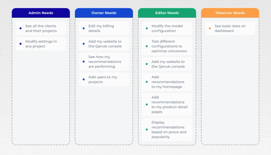
We characterized the types of users that would appear in the console and created User Needs.
Competitor analysis
To better understand the market and explore patterns used in SaaS products, we analyzed different platforms with a focus on:
— registration process — creation, editing of the project — language used — Dashboard design — User guide / FAQ
List of functionalities
We created a list of functionalities and then divided them into individual views. We distinguished functionalities that are global and considered which of them should be designed first.
Wireframes
Based on our research and previous work, we started designing simple wireframes.
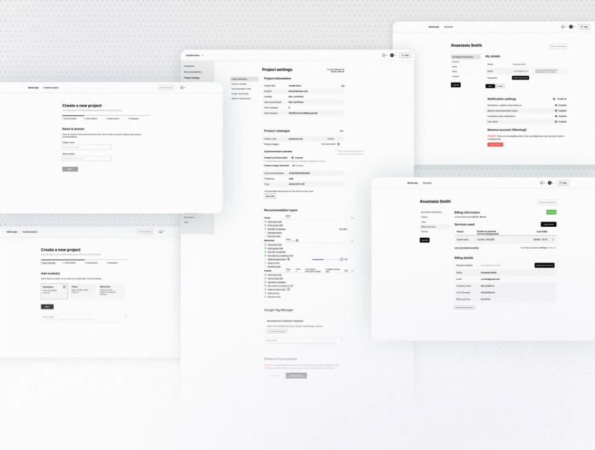
Feedback
After designing the basic console views, we met with the development team and walked them through all the screens. They pointed out the places that needed to be refined, clarified technical doubts, and together we determined if any of the processes could be simplified.
Subsequent iterations
In the next stage we refined the wireframes, consulted with engineers, and added views of lower priority.
Notifications and permissions
We prepared a database with all notifications, messages, statuses, and permissions of particular types of users. This way we avoided designing all possible versions, and developers have one place where they can check it.
Design
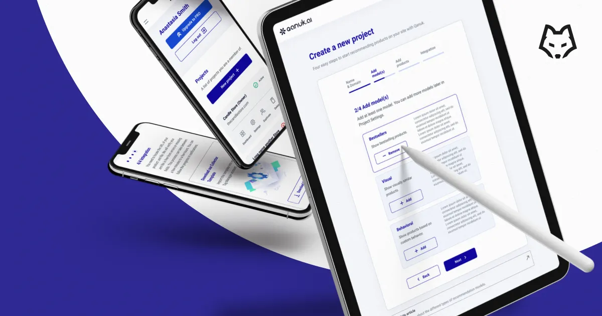
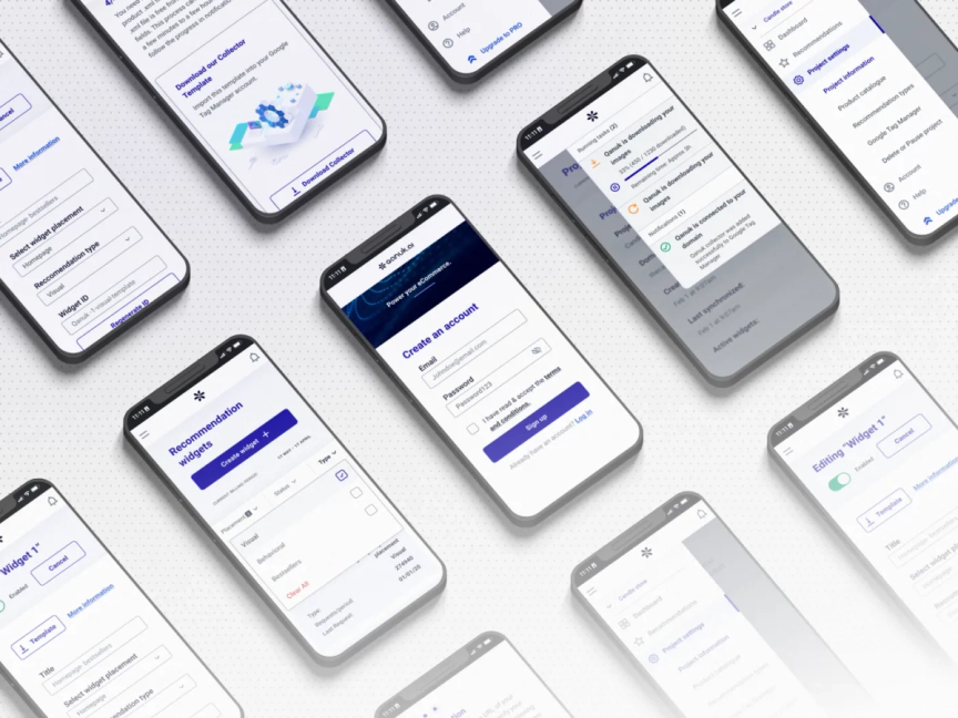
After accepting the wireframes, it was time to add a UI to the console, choosing colors and icons. Priority was given to desktop design, but we also prepared designs for mobile. The design was supposed to be simple, easy to understand, and without complex graphic elements.
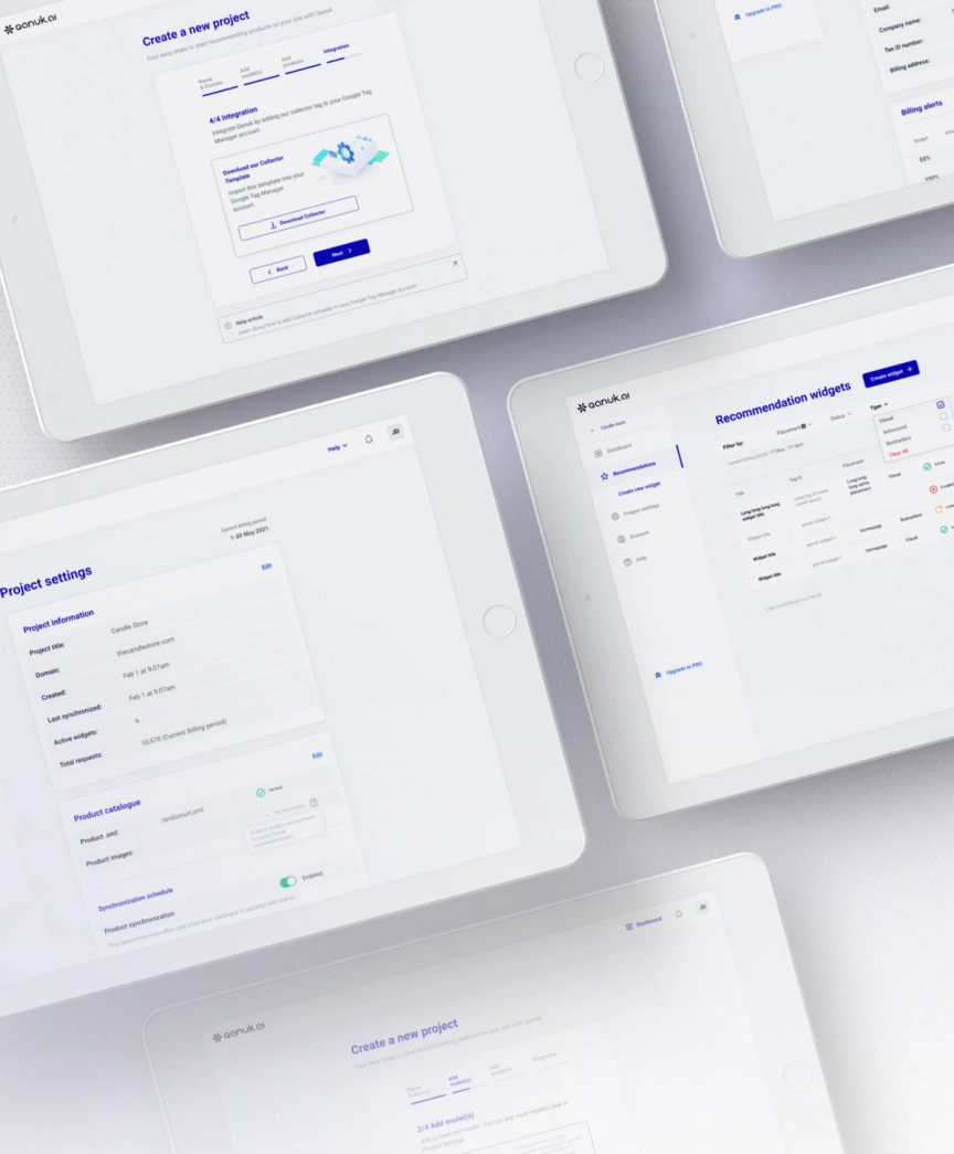
Creating a design required the creation of numerous components. We wanted to focus on accessibility and intuitiveness, so that the user could easily locate themselves and what they can do at each level. The entire project is based on containers that contain information/settings of only one category at a time. Thanks to this, it is easy to adapt the design to other devices and rearrange their layout. The user is guided through both the registration process and the creation of widgets. Because of that, they are aware of what the next steps will be (progress bars and buttons describing specific actions) as well as a number of notifications about potential errors and successes of the steps carried out.
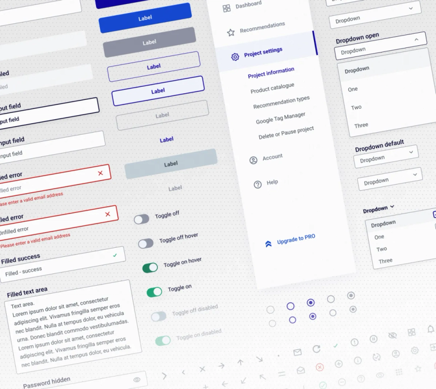
Initially, the process of installing widgets seemed complicated, so the priority was to minimize the clutter and create a clear design. The goal was for the user to feel guided by the system and, if lost, could easily find hints or articles answering their doubts. In the project settings, users will find a clear division into the functions they are interested in and the ability to quickly turn on or off various options and edit their data.

Solutions
Project creation
The process of creating a project consists of several steps:
Once completed, Qanuk starts collecting data, but the recommendations will only appear when there is enough information to generate them. While waiting for this, the user can create their first recommendation widget, test the carousel with provided sample products, and adapt its look to the whole website. They can customize its location and the recommendation type.
What was important for us while designing the widget creation process was to show each stage and the overall progress. At any point that might be difficult for the user, we added links to helpful articles, and in the future, there will also be a chat available. If the user is not able to finish the process, he can save the form and come back to it in a convenient moment.
Logical notifications and project settings
In the entire project, it was essential for us to inform the user what is currently happening in the system and what Qanuk is working on behind the scenes. That is why we designed an alert system which combines notifications with running tasks. The user can not only see what is happening, but can also pause a process or go to the error log. Also in the settings view, they can see all the requirements related to particular types of recommendations, their statuses, and after clicking on a particular requirement a detailed report.
Customer-centered account features
Each user can have any number of projects, so the user account takes precedence. Here the user can manage their projects, grant access to other users, and track costs. The client pays for the number of recommendations received, so we give the user the possibility to set a monthly budget and alerts, e.g., alert when 50% of the budget is used up.
Conclusions
Designing a SaaS service was a fascinating and educating experience, more so because we created it for our internal client. We learned the technical issues related to ML and had the opportunity to work with data scientists.
We learned how to map a complex system, and its processes, how to think about different types of users (editor, viewer…), and what permissions these roles should have.
Ultimately, we found that when designing a SaaS platform, it’s highly important to keep project documentation on an ongoing basis. Thanks to the fact that a lot of things were tracked in a spreadsheet, it was much easier to answer the questions that arose at further stages.
The next step we would like to take in this project is user testing before the service is launched. And after the launch, monitoring the application, listening to users’ needs, and developing the platform and its functionalities.
Thanks for reading!
Qanuk’s UX and Strategy have been created by: Danuta Sęczkowska, Clara Shen. Design by Mateusz Kozieł.

